Hurley
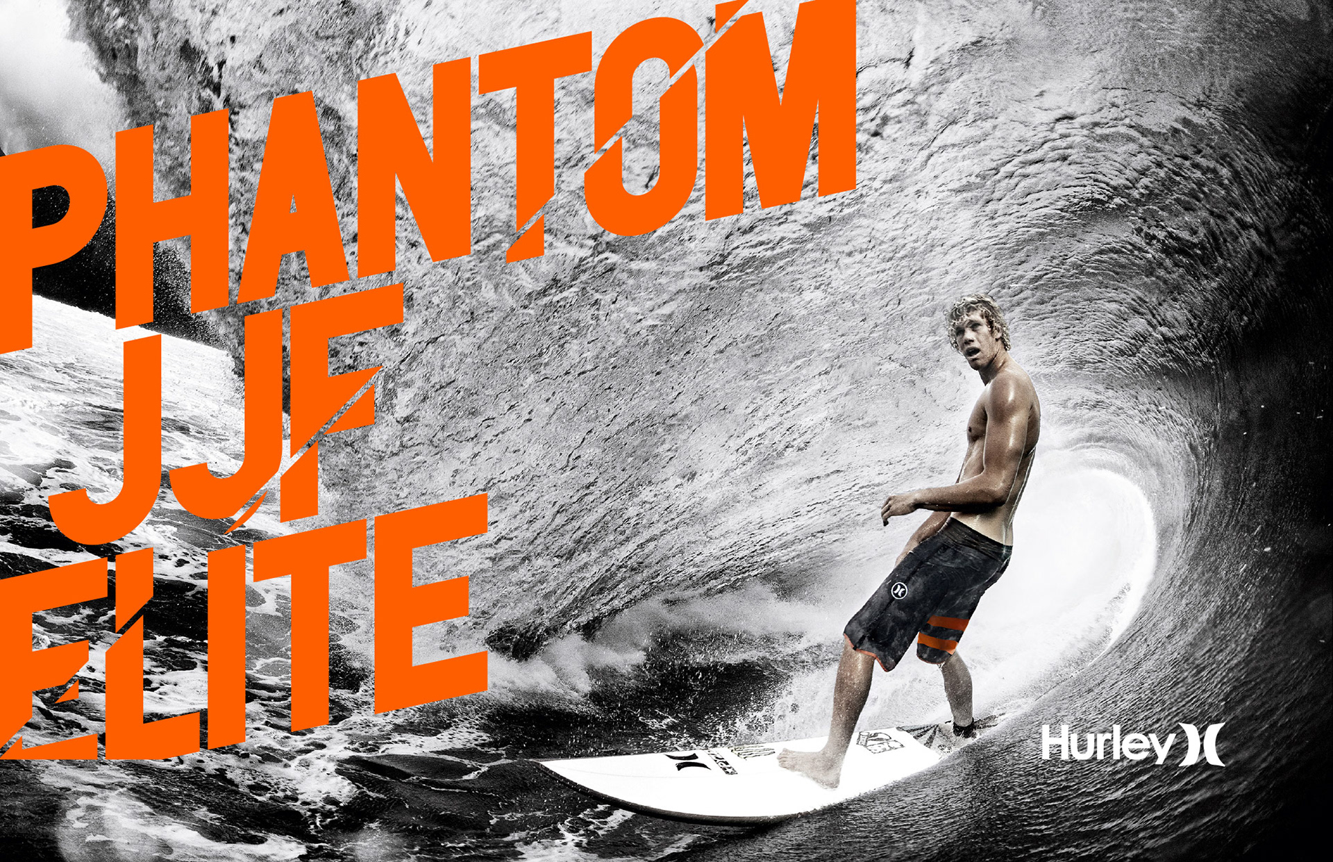
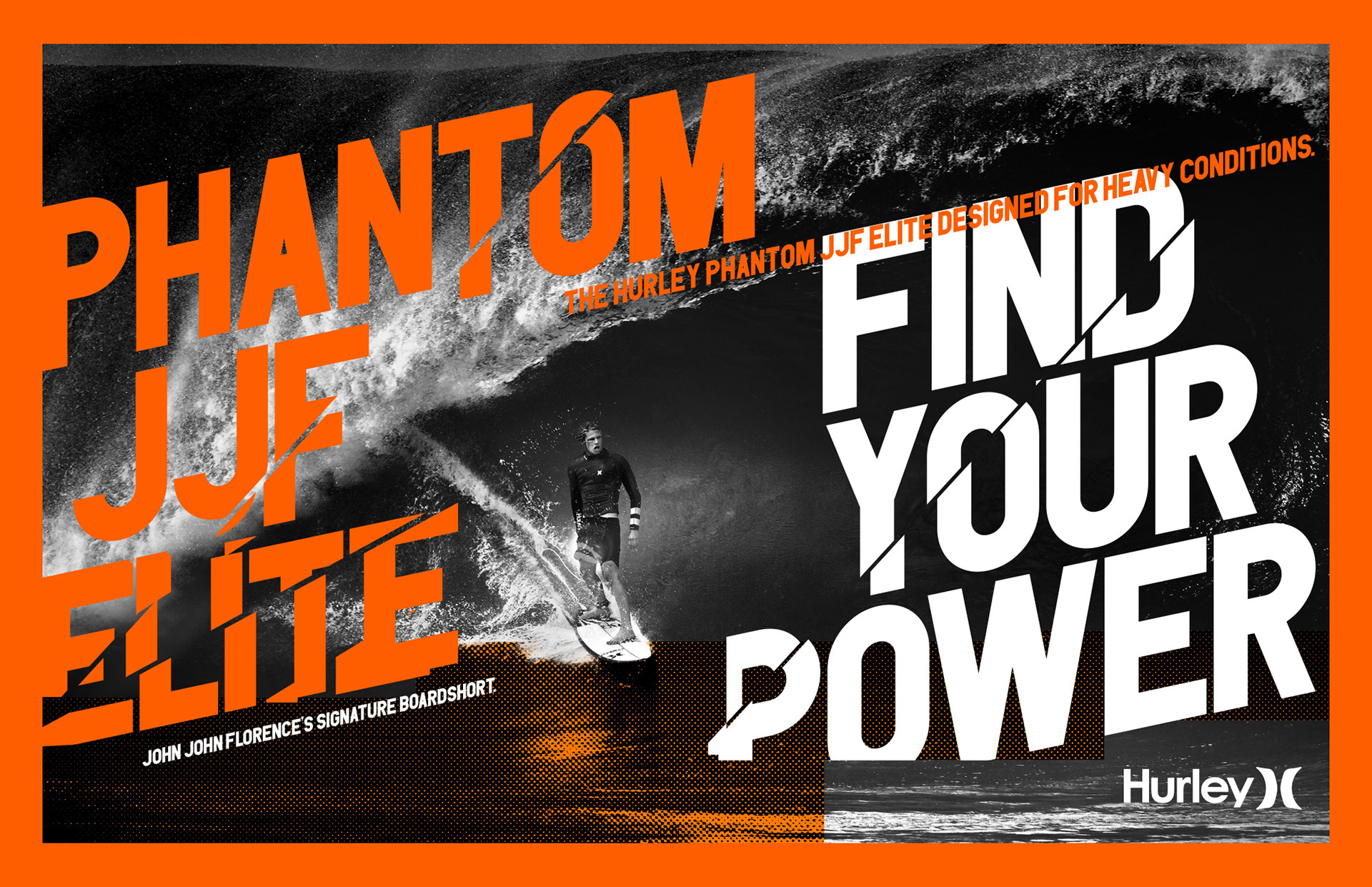
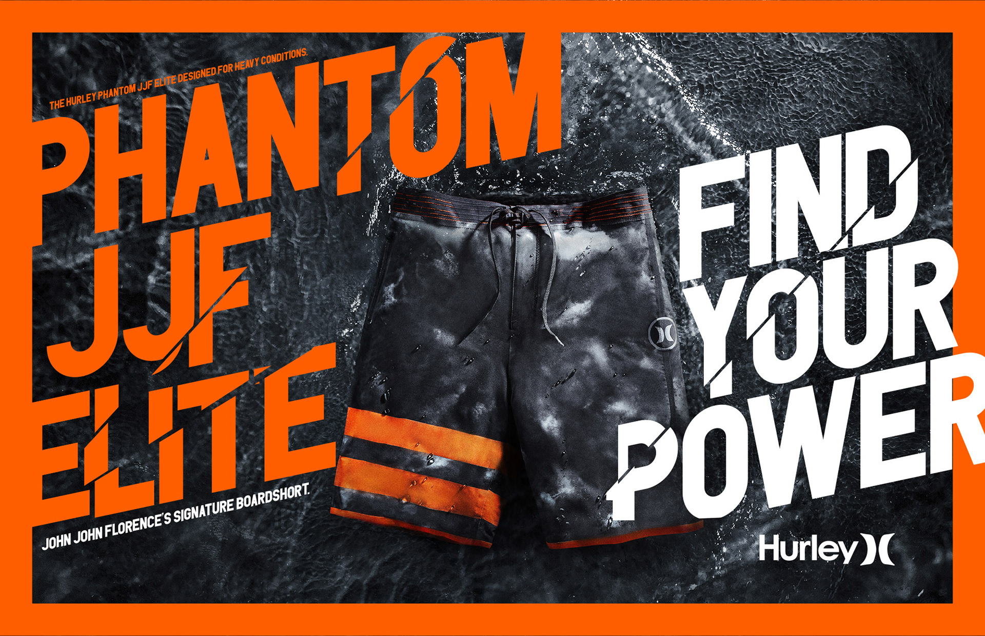
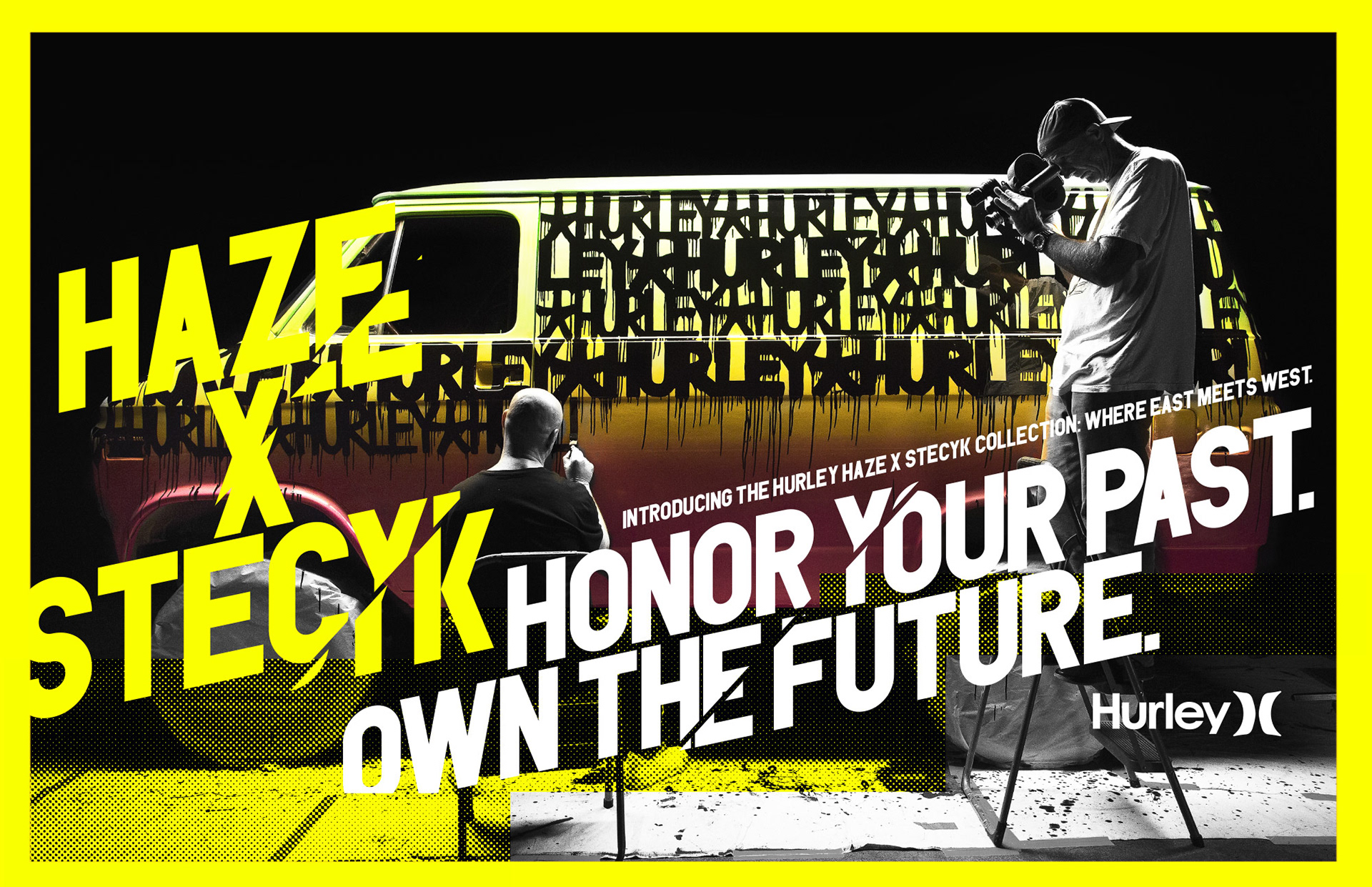
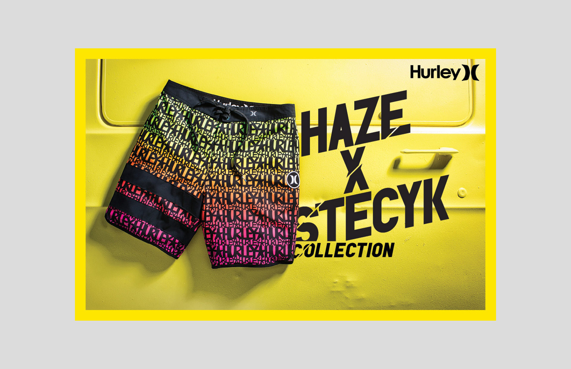
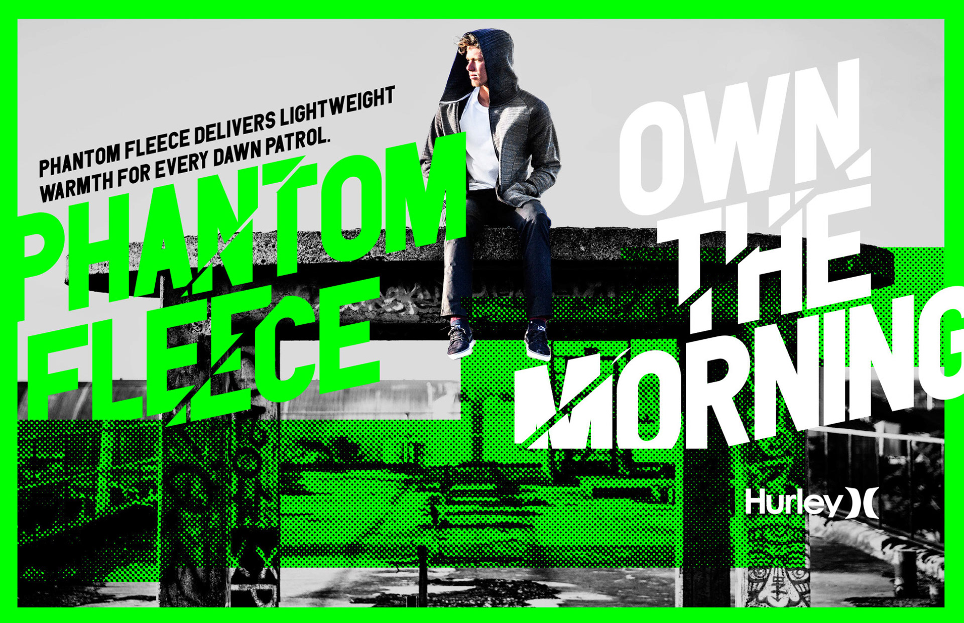
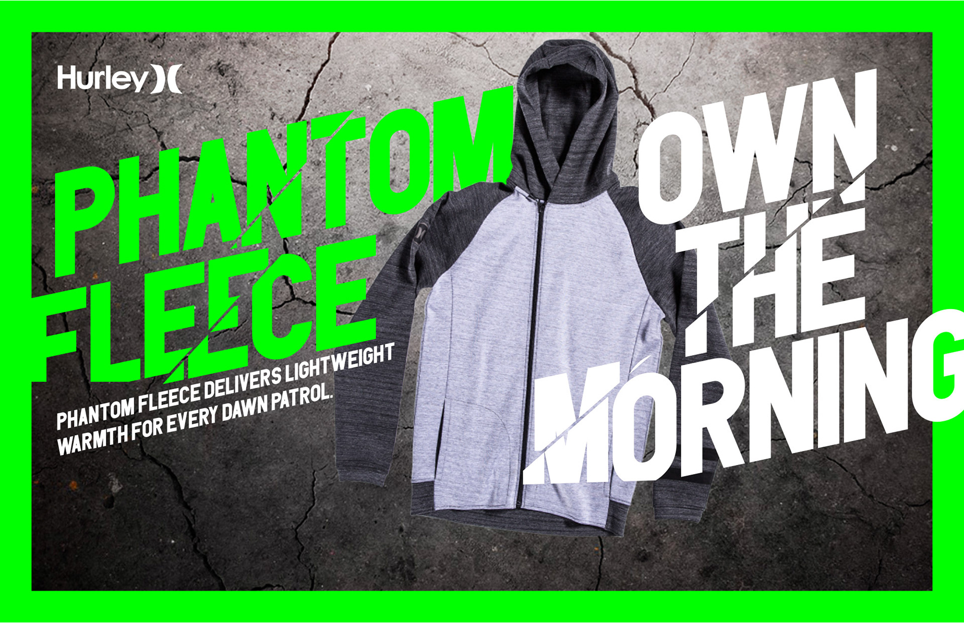
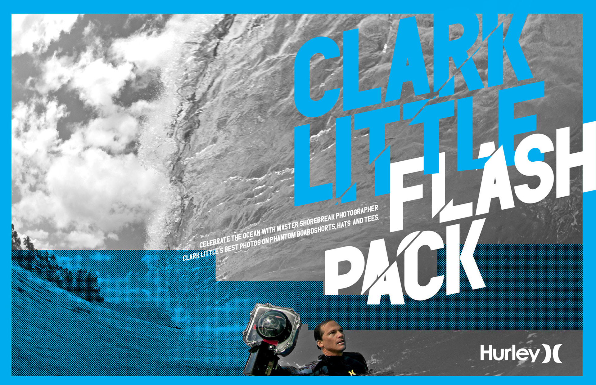
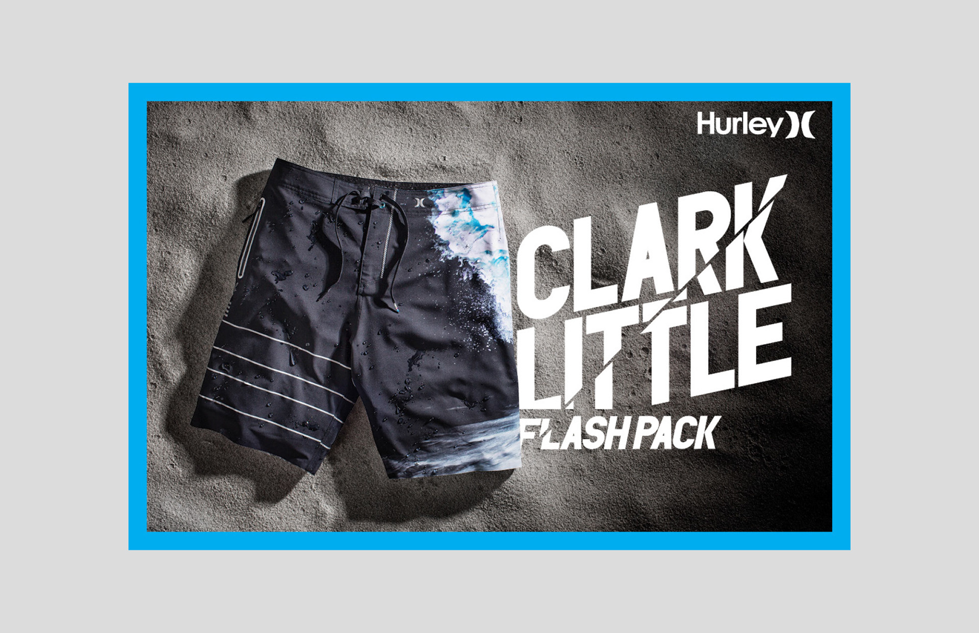
Typography design, brand refresh and seasonal brand direction for Hurley. The theme of the campaign is 'Progress in Work' — always striving for progression through hard work, you are always a work in progress. The type direction needed to be bold, iconic and flexible enough to use and scale across multiple stories online, primarily on Hurley.com and in print. Custom typography echoed the theme and was paired with raw utilitarian black and white photography along with a hit of a fifth color unique to each story.